The main official source of all COVID19 related data is the MoHFW, Government of India website.
A Covid-19 DataVisualization dashboard developed by a group of students, postdocs, faculty, and researchers from the Nutrition Group@IITB, CTARA, Climate Studies, and GISE Lab, Computer Science and Engineering, IIT Bombay.
A district-level GIS map is its main feature. It is updated real-time as per MoHFW data.
- CoVid19India.org Tracker
They have volunteering opportunities in Data Crowdsourcing, Data operations and development.
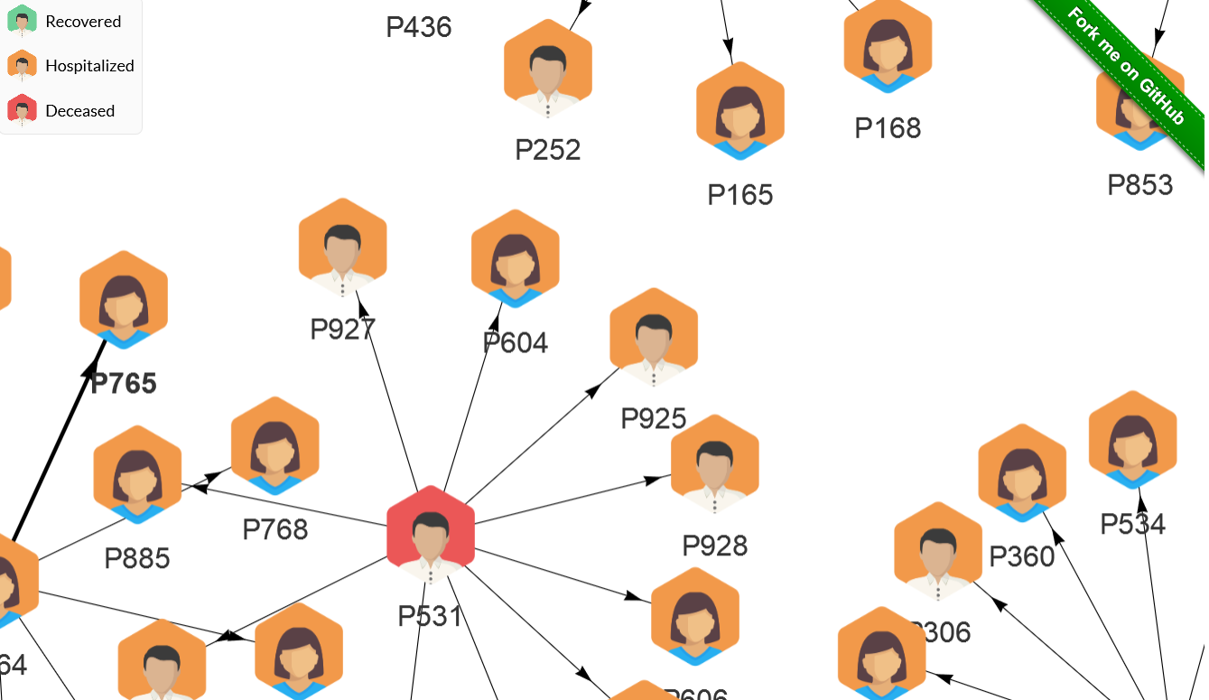
View the Cluster graph here https://cluster.covid19india.org/
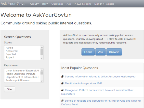
- 3. Thejesh GN
A Data enthusiast has created this simple visualization (not updated)
This post will be frequently updated.
If you come across any interesting visualizations, please leave a comment.
The following two tabs change content below.


Bureaucrat exploring the intersection of Technology,Society and Soul. Government 2.0 Advocate, Open Gov believer, Open Source enthusiast, Father, Husband. *** A Knowledge sharing initivative. Opinions are personal ********
Latest posts by Nagarajan M (see all)
- Teachers can now take Attendance in Google Meet when Teaching Online - May 30, 2020
- Some Best Visualization of CoVid19 Crisis - March 29, 2020
- The Story of Creation of the Digital Village that defied the Cash ban #Demonitisation - November 17, 2016
![WordPress in Government – SWOT Analysis and Strategies –[video]](http://govpreneur.in/wp-content/themes/mts_sociallyviral/images/nothumb-sociallyviral-featured.png)


Thank you for including the dimensional analysis dashboard I’ve been working on 🙏🏽